Core Principles of Multi-Platform Visual Strategy

A strong visual strategy helps you show the same brand across many channels without wasting time. It sets clear rules for images, layout, and formats so your brand presence stays clear, consistent, and easy to scale in multi-platform marketing.
What Is a Multi-Platform Visual Strategy
A multi-platform visual strategy defines how your visuals appear across websites, ads, email, and social platforms. You plan images so they adapt to different sizes while keeping the same look and message.
You focus on consistent images across platforms, even when layouts change. Colors, fonts, framing, and subject placement stay stable.
This protects your brand identity when you publish many versions of the same asset. A good strategy also supports one prompt, multiple sizes workflows.
You design visuals once, then output them in formats that match platform needs, such as social media image sizes in 2026. This reduces rework and limits errors.
Core elements you control
- Color and contrast
- Logo placement and safe zones
- Image style and framing
- Text limits per size
Benefits of an Integrated Visual Approach
An integrated approach saves time and keeps quality high. You stop fixing broken crops and mismatched colors across channels.
You gain brand consistency across your full multi-platform presence. When people see your content on different platforms, they recognize it right away.
This builds trust through repetition. You also improve team speed.
Clear rules reduce guesswork and reviews. Designers, marketers, and tools work from the same visual system.
Key benefits
- Faster campaign launches
- Fewer design revisions
- Clear brand presence at every touchpoint
- Easier scaling for ads and content updates
Building a Cohesive Brand Experience
A cohesive brand experience comes from alignment, not sameness. You adapt layouts to each platform while keeping the same visual logic.
You start with a shared visual system. This includes approved colors, image ratios, and layout rules.
You then adjust spacing and emphasis based on how each platform displays content. You should test visuals in real contexts.
Check feeds, previews, and devices before launch. This step prevents surprises and protects brand identity.
Platform fit vs. consistency
| What stays the same | What can change |
|---|---|
| Colors and style | Image size |
| Logo rules | Crop and layout |
| Visual tone | Text length |
Defining and Maintaining Visual Identity
A strong visual identity lets you publish images across many platforms without losing clarity or recognition. You need clear rules for brand visuals, written standards, and repeatable elements that work at different sizes.
Elements of Visual Identity
Your visual identity includes the parts people see and remember. These elements must stay stable, even when image sizes change.
Key elements include:
- Color scheme and color palette: Define primary and secondary colors. Use exact color codes so colors stay the same on web, social, and email.
- Logo variations: Prepare full logos, icon-only logos, and light or dark versions. Each version should fit different layouts without distortion.
- Typography: Choose fonts for headlines, body text, and accents. Set clear rules for size, spacing, and alignment.
- Imagery style: Decide on photo lighting, subjects, backgrounds, and filters. Keep the same look across platforms.
These elements form the base of your visual branding. If one part changes often, your brand visuals will feel inconsistent.
Developing a Style Guide
A style guide turns your visual identity into clear instructions you can follow every day. It removes guesswork when you create or resize images.
Your style guide should include:
| Section | What to define |
|---|---|
| Logos | Usage rules, spacing, and size limits |
| Colors | Approved palette and contrast rules |
| Fonts | Allowed fonts and fallback options |
| Images | Cropping rules and focal points |
Write your brand guidelines in simple language. Show examples of correct and incorrect use.
Store the guide where your team can access it fast. When you use one prompt to generate multiple sizes, the style guide keeps results aligned across formats.
Establishing Consistent Branding Elements
Consistent branding depends on repeatable systems, not manual fixes. You should lock down elements that never change and adapt only what the platform requires.
Focus on these practices:
- Use the same profile image and logo placement across platforms.
- Build templates that already include your color palette and typography.
- Keep text density similar when resizing images to avoid clutter.
- Check brand visuals side by side before publishing.
Consistency does not mean identical images. It means viewers recognize your brand, whether they see a banner, ad, or social post.
This approach supports a multi-platform visual strategy and reduces rework as platforms evolve.
Adapting Visual Content for Multiple Platforms

You face different size rules, viewing habits, and content limits on each channel. Strong results come from matching layout, format, and pacing to how people use each platform.
Platform-Specific Visual Requirements
Each platform enforces its own visual rules. Ignoring them leads to cropped images, weak framing, or unreadable text.
Focus on aspect ratio, safe areas, and text density. Social feeds favor tall or square images, while websites and print need wider layouts.
| Platform use | Common formats | Key requirement |
|---|---|---|
| Instagram feed | 1:1, 4:5 | Clear focal point |
| Instagram Stories | 9:16 | Text inside safe margins |
| Reels / short videos | 9:16 | Motion in first seconds |
| LinkedIn posts | 1:1, 16:9 | Readable text |
| Print ads | Custom | High resolution (300 DPI) |
You protect brand consistency by planning platform-specific visuals early. Start with a master design, then adjust size and spacing instead of cropping blindly.
Tailoring Assets for Social, Web, and Print
Social, web, and print serve different goals. You should design with intent, not reuse the same file everywhere.
Social visuals need speed and clarity. Use bold headlines, limited text, and clear contrast.
Carousel posts work best when each slide carries one idea. Web visuals must support reading flow.
Use wider images, lighter text, and flexible layouts that scale across screens. Print ads demand precision.
You must use exact dimensions, bleed space, and CMYK color. Small text and thin lines often fail in print.
Keep one visual system, but adjust information density by channel.
Optimizing for Short-Form and Vertical Video
Short-form video and vertical video now drive reach on most social platforms. You must design for movement, not still frames.
Reels, Instagram Stories, and other short videos rely on fast hooks. Use motion, captions, and visual change within the first three seconds.
Follow these rules for visual optimization:
- Keep key elements centered for vertical viewing
- Add captions for silent playback
- Avoid small text near edges
- Design for looping playback
Short-form video works best when visuals carry the message without sound. Plan layouts for 9:16 first, then adapt to other sizes.
Ensuring Messaging and Visual Consistency
You build trust when your visuals and words match across platforms. Clear rules for brand voice and storytelling help you keep consistent branding while you adapt images to many sizes.
Unified Brand Voice across Channels
You need one clear brand voice that works on every platform. Set rules for tone, word choice, and image style, then apply them everywhere.
This supports brand recognition and improves brand recall over time. Keep these elements consistent in every asset:
- Tone: friendly, direct, or formal
- Language: common words, short sentences
- Visual cues: colors, fonts, logo use
Use a short style guide that teams can follow fast. When you create multi-size image generation from one prompt, keep captions and overlays aligned with that voice.
This avoids mixed signals when images resize or crop for different feeds.
A simple check helps before publishing:
| Checkpoint | Yes / No |
|---|---|
| Same tone across posts | |
| Same color and font use | |
| Logo placed the same way |
Aligning Messaging for Consistent Storytelling
Consistent messaging means you tell the same story, even when formats change. Start with one core message.
Then adapt it to each platform without changing meaning. Plan your story in layers.
The headline states the value. The image shows the idea.
The caption adds one clear detail. When you scale to consistent images across platforms, keep those layers intact.
Focus on specifics that repeat:
- One key benefit per campaign
- One action you want users to take
- One visual theme tied to that message
When you align visuals and text this way, your multi-platform visual strategy stays clear. You reduce confusion and strengthen brand recall with every view.
Strategies for Maximizing Engagement and Conversions
Strong visuals drive engagement when you match story, source, and channel. You improve engagement rates by telling clear stories, using real customer content, and guiding viewers across platforms with purpose.
Visual Storytelling Techniques
Visual storytelling works best when you plan images as a connected system, not as single posts. You should design each visual to support multi-platform storytelling while keeping a consistent look.
Focus on one clear message per image. Use the same colors, layout, and focal point across sizes to keep consistent images across platforms.
Key techniques that support audience engagement:
- Show action instead of static poses to increase engagement.
- Place the subject in the center-safe area so crops stay effective.
- Use short text overlays only when they add meaning.
- Sequence visuals to tell a story across posts, ads, and emails.
Leveraging User-Generated Content
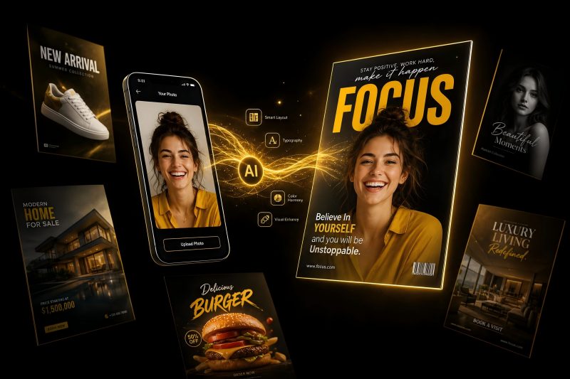
User-generated content builds trust and supports conversions because it shows real use, not polished claims. You should invite customers to share photos or short videos, then adapt them for multiple platforms.
UGC works well for influencer partnerships, reviews, and product launches. You increase engagement when you highlight real people and clear outcomes.
Best practices for using UGC:
- Ask for permission and credit creators clearly.
- Keep edits light to preserve authenticity.
- Resize content carefully to avoid cutting faces or products.
- Pair UGC with a simple call to action.
When you combine UGC with a consistent visual style, you improve engagement without weakening your brand image.
Cross-Promotion and Audience Segmentation
Cross-promotion increases engagement when each platform has a clear role. You should guide users from one channel to another instead of repeating the same visual everywhere.
Segment your audience by behavior, not just age or location. This helps you match visuals to intent and improve conversions.
| Platform | Visual Focus | Primary Goal |
|---|---|---|
| Lifestyle images | Engagement | |
| Clean graphics | Thought leadership | |
| Clear banners | Conversions |
Use platform data to track engagement rates. Adjust visuals based on what drives clicks, saves, and sign-ups.
Planning, Execution, and Measurement Tools

You need clear planning, reliable execution, and accurate measurement to keep visual content consistent across platforms. The right tools help you manage sizes, timing, and results without losing brand clarity or wasting effort.
Content Calendar Management
A strong content strategy starts with a shared content calendar.
You plan what to publish, where it goes, and which image sizes each platform needs.
This approach supports consistent images across platforms and reduces last-minute edits.
Use a calendar that tracks:
- Platform and post type
- Image size and format
- Campaign goal and SEO focus
- Owner and deadline
Tools like Buffer, Hootsuite, and Sprout Social let you plan weeks ahead.
They also show posting times and queue content by channel.
When you link your calendar to your visual workflow, you can prepare multi-size image sets from one prompt.
Assign them to each post with purpose.
Design and Scheduling Tools
You need design tools that handle multi-size image generation and fast edits.
Canva works well for quick layouts and social media sizes.
Adobe Creative Cloud supports advanced control for ads, landing pages, and web visuals.
Figma and Sketch help teams design shared systems and reusable components.
Pair design with scheduling to reduce friction.
Many teams design once, export multiple sizes, and schedule directly through Buffer or Hootsuite.
Key needs to prioritize:
- Preset sizes for 2026 social platforms
- Brand styles and locked elements
- Easy resizing without breaking layout
Analyzing Performance Metrics
Measurement shows whether your visuals support real goals.
Focus on performance metrics that match each platform and use case.
Social posts rely on engagement metrics like likes, shares, and saves.
Campaign assets need conversion metrics such as clicks, sign-ups, or sales.
Use analytics tools from platforms and third-party dashboards to compare results by size and format.
Track:
- Engagement rate by image size
- Click-through rate by platform
- Conversion rate tied to visuals
- SEO impact for blog and landing images
Advanced Tactics for Multi-Platform Visual Strategy
Advanced visual work relies on precision, testing, and clear standards.
You improve results when you adapt visuals to real user needs, platform limits, and measurable performance data.
Data Visualization and Infographics
You use data visualization to explain complex ideas fast.
Clear charts and infographics work well in digital marketing, especially for SEM ads, blogs, and landing pages.
Design each visual for the platform size and use case.
A long chart may fit a blog but fail on social feeds.
Best practices
- Use one core data set with multiple layouts
- Limit colors to your brand palette and correct color profiles
- Label data clearly and avoid small text
Strong visuals support key content themes and keep messages consistent across platforms.
Accessibility and Inclusive Design
You expand reach when you design for accessibility.
Many users rely on assistive tools or have vision limits.
You should plan accessibility from the start, not as a fix later.
Key actions
- Keep high contrast between text and background
- Add alt text to images and infographics
- Avoid color-only meaning in charts
Accessible visuals also improve clarity for all users.
Platforms reward clear content with better engagement and reach.
Experimenting with Emerging and Niche Platforms
You gain early traction when you test emerging platforms and niche networks.
These platforms often favor native formats and simple visuals.
Start small and test one variable at a time, such as aspect ratio or text density.
What to test
| Element | Why it matters |
|---|---|
| Image size | Reduces compression loss |
| Color profile | Prevents color shifts |
| Layout | Matches platform habits |
You reuse core visuals but adjust layout and pacing to fit each platform.
Incorporating Case Studies for Continuous Improvement
You use case studies to guide decisions with real results.
Each case should track inputs, outputs, and outcomes.
Focus on visuals tied to clear goals, such as clicks, leads, or conversions.
Track and review
- Platform used and image sizes
- Visual style and content theme
- Performance in SEM and organic posts
Each case study informs the next campaign and strengthens your multi-platform visual strategy.
Frequently Asked Questions
This section explains how to adapt visuals for each platform, keep brand consistency, engage users, measure results, and design with real user behavior in mind.
It focuses on practical actions you can apply across social, web, ads, and email.
How can a visual strategy be effectively adapted for different digital platforms?
You adapt a multi-platform visual strategy by designing for each platform’s size, layout, and use case.
Start with a core image, then generate or export versions that match platform rules.
Use platform-specific sizes, such as square or vertical formats for social feeds and wide formats for websites.
Plan crops in advance so key content stays visible in every version.
What are the best practices for ensuring brand consistency across multiple platforms?
You keep consistent images across platforms by using the same colors, fonts, and visual style in every asset.
Lock these rules in a clear brand guide.
Create a shared asset library with approved images and templates.
Use the same visual base when you generate multiple sizes to avoid style drift.
What techniques work well to engage audiences across diverse digital mediums?
You engage users by matching visuals to how people use each platform.
Social users respond well to simple, bold images, while website visitors expect clarity and detail.
Adjust contrast, spacing, and text size for each screen.
Short attention platforms need fast visual impact, while long-form pages benefit from clean structure.
Could you identify the key metrics for measuring the success of a visual strategy on various platforms?
You measure success using metrics tied to each platform’s goal.
Common metrics include click-through rate, engagement rate, and conversion rate.
For social media, track saves, shares, and comments.
For ads and landing pages, focus on conversions and time on page.
What role does user experience (UX) play in the development of a cross-platform visual strategy?
UX shapes how clearly users understand and interact with your visuals.
Good UX makes images easy to scan, read, and act on.
Respect safe zones so text and products avoid UI overlays.
Optimize file size and resolution so pages load fast on all devices.
How does platform-specific audience behavior influence visual strategy decisions?
Audience behavior tells you how to design and size your visuals.
Mobile-first platforms favor vertical images and simple layouts.
Professional platforms often need cleaner visuals with clear messages.
Entertainment-focused platforms reward emotion, motion, and strong contrast.