A flyer has about two seconds to grab attention. In that window, the reader decides whether to keep reading or toss it aside. The difference between a flyer that converts and one that gets ignored comes down to design fundamentals — visual hierarchy, typography, color, and layout.
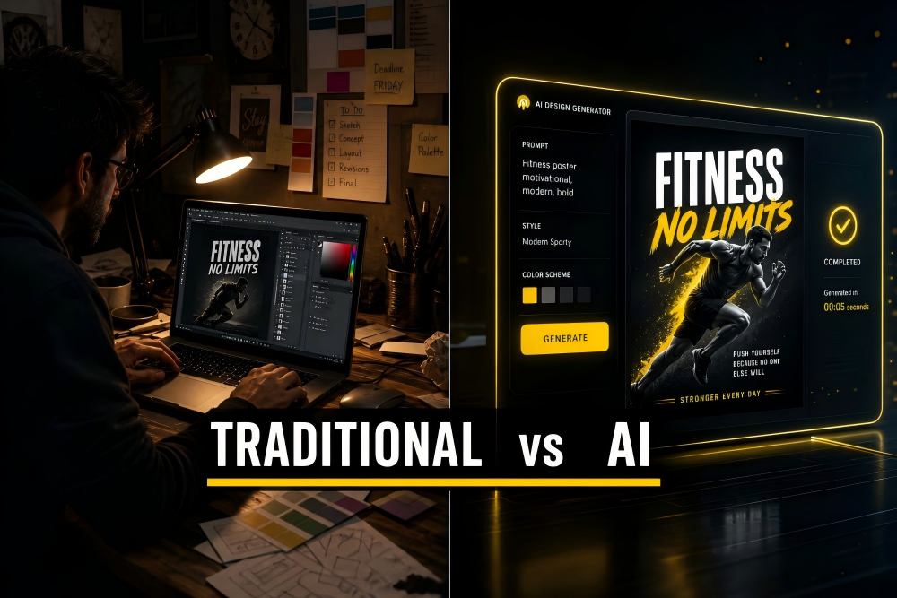
The good news: you do not need a design degree to apply these principles. With an AI flyer generator, many of these best practices are handled automatically. But understanding why they work helps you write better prompts and evaluate the results.
This guide covers 10 proven flyer design tips. Each tip includes the design principle, why it matters, and a practical prompt example showing how to apply it in the PixExact AI Flyer Generator.
Quick Checklist: Flyer Design Essentials
Use this checklist before finalizing any flyer — whether AI-generated or manually designed:
| Element | Check |
|---|---|
| Headline is the largest, most visible text | Yes / No |
| One clear call to action (not three) | Yes / No |
| No more than two font styles | Yes / No |
| Colors match the tone (urgent = red/bold, calm = blue/pastel) | Yes / No |
| Key info is inside the safe zone (not near edges) | Yes / No |
| Phone number, website, or QR code is easy to find | Yes / No |
| Enough white space — elements are not crowded | Yes / No |
| Correct size for the distribution method | Yes / No |
| File is 300 DPI for print | Yes / No |
| QR code is real and scannable | Yes / No |
Print this checklist or bookmark this page. Now let us break down each principle.
Tip 1: Establish a Clear Visual Hierarchy
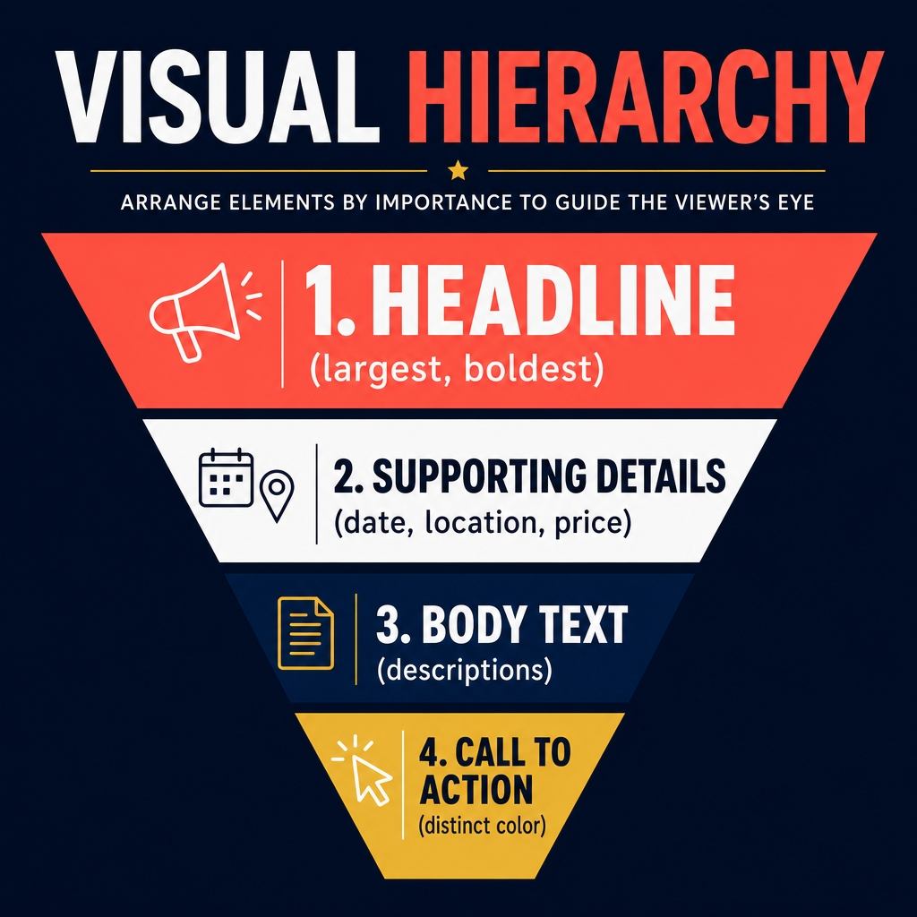
Visual hierarchy controls the order in which someone reads your flyer. The human eye naturally moves from the largest element to the smallest, from bright to muted, and from top to bottom.
Why it matters: Without hierarchy, every element competes for attention and nothing stands out. The reader's eye has nowhere to land first, so they move on.
The hierarchy rule for flyers:
- Headline — the biggest, boldest text. This is your hook: the offer, the event name, the key message.
- Supporting details — date, time, location, price. Medium-sized, clearly readable.
- Body text — descriptions, feature lists, terms and conditions. Smallest text.
- Call to action — visually distinct (different color, button shape, or placement) so it stands out from the body.
How AI handles this: When you write a clear prompt with a defined headline and supporting details, PixExact automatically sizes and positions elements following hierarchy principles. The headline becomes the dominant visual element.
Prompt example:
"Create a flyer for a Summer Clearance Sale at Urban Outfitters Plus. Headline: UP TO 60% OFF EVERYTHING. Sale runs July 5 through July 20. Visit us at 340 Market Street, open 10 AM to 8 PM daily. Bold and high-energy with bright coral and white colors, clean modern layout with the headline as the dominant element."
Design tip: If your AI-generated flyer buries the headline or makes the date the same size as the offer, refine your prompt. Put the most important information first and use words like "headline" and "bold" to signal priority.
Tip 2: Use No More Than Two Fonts
Typography is one of the fastest ways to make a flyer look professional — or amateur. The most common mistake is using too many fonts.
Why it matters: Every additional font adds visual noise. Two fonts (one for headlines, one for body text) create contrast while maintaining cohesion. Three or more fonts make the flyer look chaotic and unplanned.
The two-font rule:
- Headline font: A display or bold sans-serif that grabs attention (large, heavy weight).
- Body font: A clean, readable sans-serif or serif for details and descriptions (regular weight).
How AI handles this: PixExact selects and pairs complementary fonts automatically based on the style you describe. Describing the mood ("modern," "elegant," "playful") guides the AI's font selection.
Prompt example:
"Design a professional networking event flyer for the Austin Business Leaders Mixer. Date: Thursday, October 9th, 6 PM to 9 PM. Location: The Rooftop Lounge, 200 Congress Avenue. Free for members, $15 for guests. RSVP at austinbizleaders.com. Sophisticated and modern with charcoal gray and gold accents, clean sans-serif typography throughout."
Design tip: Avoid mentioning specific font names in your prompt — the AI performs best when you describe the feeling (clean, bold, elegant, playful) rather than a specific typeface.
Tip 3: Apply Color Psychology
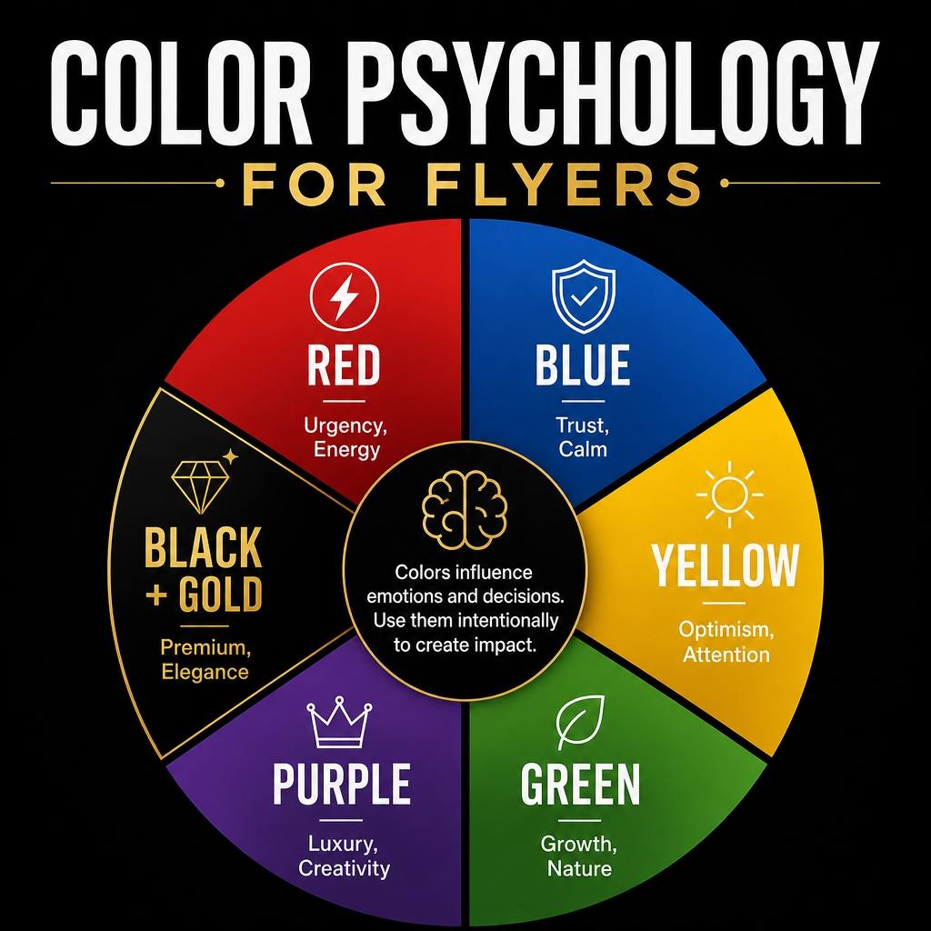
Colors trigger emotional responses before the reader processes a single word. Choosing the right palette is not about personal preference — it is about matching the emotional tone of your message to the psychological associations of colors.
Why it matters: A neon green and yellow flyer for a luxury spa feels wrong instantly, even if the text is perfect. Color sets the emotional context.
Color associations for flyers:
| Color | Emotion / Association | Best For |
|---|---|---|
| Red | Urgency, excitement, energy | Sales, clearance events, food |
| Blue | Trust, professionalism, calm | Corporate events, healthcare, finance |
| Green | Nature, growth, health | Eco brands, wellness, landscaping |
| Yellow | Optimism, warmth, attention | Seasonal events, children's activities |
| Orange | Enthusiasm, creativity, action | Fitness, grand openings, youth events |
| Purple | Luxury, creativity, spirituality | Beauty, arts, faith events |
| Black + Gold | Premium, exclusivity, elegance | Luxury brands, galas, high-end services |
| Pastels | Softness, femininity, calm | Weddings, baby showers, wellness |
How AI handles this: When you specify colors and mood in your prompt, the AI builds the entire palette around those cues — background, text color, accent elements, and imagery all coordinate.
Prompt example:
"Create a flyer for a Valentine's Day Special at Bloom Flower Shop. 20% off all bouquets, February 10 through 14. Order at bloomflowers.com or call 555-0211. Romantic and elegant with deep red and soft pink tones, gold accents, floral photography style."
Design tip: Limit your palette to 2-3 colors. One dominant color (60% of the design), one secondary color (30%), and one accent color (10%) for highlights and CTAs.
Tip 4: Position Your Call to Action Strategically
The call to action (CTA) is the single thing you want the reader to do after seeing your flyer: call a number, visit a website, scan a QR code, attend an event. If the CTA is hard to find or unclear, the flyer fails regardless of how beautiful it looks.
Why it matters: Studies consistently show that the bottom third of a flyer is where readers expect to find "what to do next." Placing the CTA there follows the natural reading flow: hook (top), details (middle), action (bottom).
CTA placement rules:
- Place the primary CTA in the bottom third of the flyer.
- Make it visually distinct — different color, larger text, or contained in a button-like shape.
- Use action language: "Call Now," "Visit Us," "Scan to Book," "Shop the Sale."
- Include only ONE primary CTA. Multiple competing actions reduce conversion.
How AI handles this: PixExact places contact information and action elements in the lower portion of the layout by default. Specifying your CTA clearly in the prompt ensures it gets prominent placement.
Prompt example:
"Make a flyer for a Free Home Energy Audit by GreenStar Solar, serving the Denver metro area. We inspect your home and show you how much you could save with solar panels. Call 720-555-0188 to schedule your free audit. Professional and trustworthy with forest green and white colors, clean layout. Make the phone number and call-to-action the most prominent element in the bottom section. Include a QR code linking to our scheduling page."
Design tip: After generating your flyer, ask yourself: "Can someone standing 3 feet away read the CTA?" If not, the text is too small or the contrast is too low. Regenerate with stronger emphasis in your prompt.
Tip 5: Embrace White Space
White space (also called negative space) is the empty area between and around design elements. It is not wasted space — it is one of the most powerful design tools available.
Why it matters: Crowded flyers overwhelm the reader. White space creates breathing room, directs the eye to important elements, and makes text more readable. Premium brands use generous white space because it communicates confidence and clarity.
The white space rule: If your flyer feels cluttered, the solution is almost always to remove elements, not to make them smaller. A flyer with 5 clear elements and ample spacing outperforms one with 15 cramped elements every time.
How AI handles this: When you describe a "clean" or "minimalist" layout in your prompt, the AI allocates more white space. Overloading your prompt with too many text elements produces a denser layout.
Prompt example:
"Create a minimalist flyer for a Grand Opening at Pure Wellness Spa, 55 Serenity Lane. Opening March 15th. Complimentary 30-minute massage for first 50 bookings. Book at purewellness.com. Serene and luxurious with white, soft gray, and pale gold colors. Minimalist layout with generous white space and elegant typography. Include a QR code."
Design tip: Limit your flyer to these core elements: headline, 3-5 lines of supporting details, one image or visual element, and one CTA. Everything else is optional. If the AI generates a busy design, shorten your prompt and remove secondary details.
Tip 6: Use High-Quality Images and Reference Photos
Images communicate faster than text. A single compelling image can set the mood, establish credibility, and draw the eye more effectively than any headline.
Why it matters: Low-quality, generic, or irrelevant images undermine trust. A blurry stock photo of a handshake on a local plumber's flyer does not connect with the audience.
Image best practices for flyers:
- One strong image is better than three mediocre ones.
- The image should directly relate to the offer or business.
- For AI-generated flyers, the prompt description of imagery guides what the AI creates.
- Uploading a reference image (your logo, product photo, or brand mood board) gives the AI a concrete visual anchor.
How AI handles this: PixExact generates imagery as part of the flyer design based on your style description. For brand-specific results, upload a reference image — the AI matches the visual style, color palette, and overall aesthetic.
Prompt example:
"Design a flyer for the Weekend Brunch Menu at The Golden Fork, 45 Elm Street. Saturdays and Sundays, 9 AM to 2 PM. Featuring avocado toast, eggs benedict, fresh-squeezed juices, and bottomless mimosas. Warm and appetizing with natural lighting, overhead food photography style, earthy tones. Include a QR code linking to our menu."
Upload your restaurant's logo as a reference image so the AI matches your brand identity.
Design tip: If you have a product photo, storefront image, or headshot that should feature prominently, upload it as the reference image and mention it in your prompt: "Use the uploaded image as the main visual element."
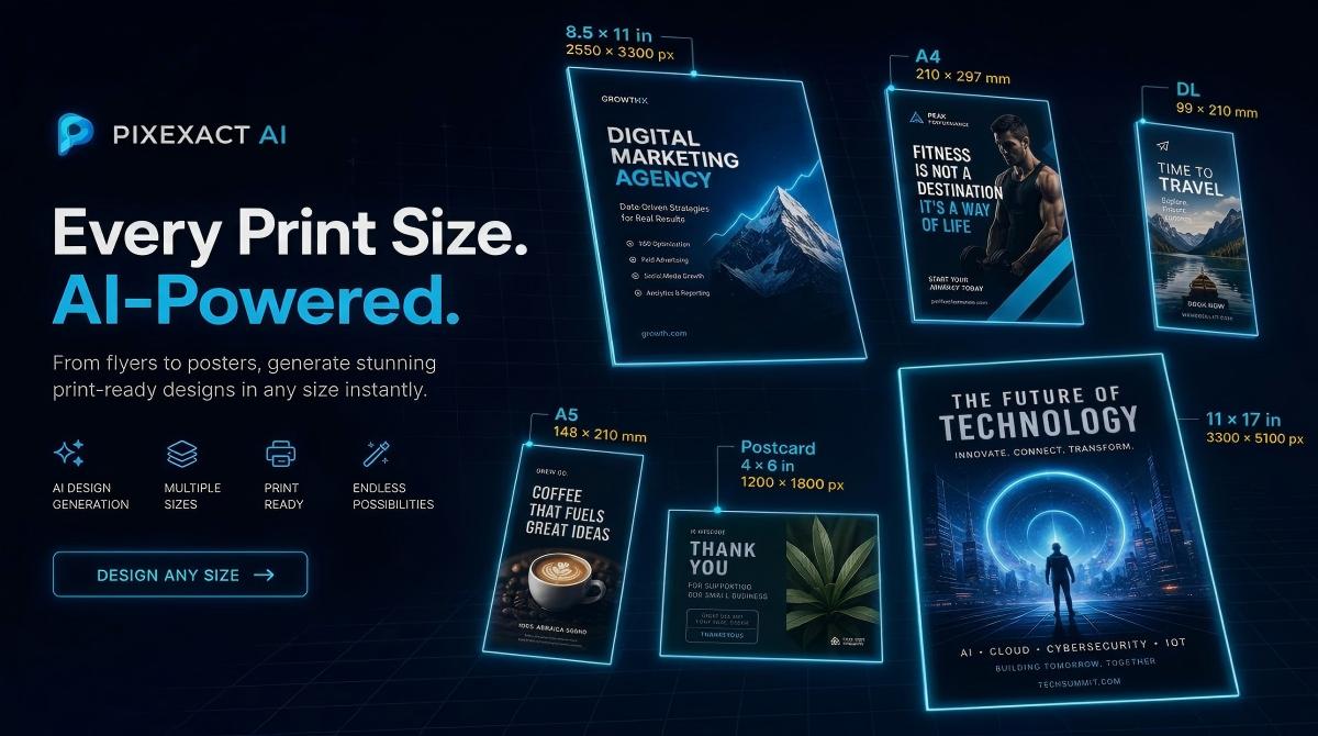
Tip 7: Choose the Right Size for Your Distribution Method
A beautifully designed flyer in the wrong size is a wasted effort. A US Letter flyer does not fit in a mailbox. A Postcard on a bulletin board is too small to read from a distance.
Why it matters: Size determines readability at the intended viewing distance, compatibility with distribution channels, and printing cost.
Size selection guide:
| Distribution Method | Recommended Size | Why |
|---|---|---|
| Bulletin boards, windows | US Letter (8.5 x 11 in) or A4 | Maximum visibility at 3-6 feet |
| Door hangers, mailbox drops | Half Letter (5.5 x 8.5 in) or A5 | Fits standard mailboxes and door handles |
| Direct mail | Postcard (4 x 6 in) or A6 | Meets postal size standards, lower postage |
| Package inserts | Postcard or A6 | Compact, fits inside shipping boxes |
| Countertop displays, racks | DL / Rack Card (3.5 x 8.5 in) | Fits standard brochure holders |
| Instagram feed | Custom: 1080 x 1350 px | Optimized for 4:5 feed ratio |
| Instagram / Facebook Stories | Custom: 1080 x 1920 px | Full-screen vertical format |
How AI handles this: PixExact offers six standard print size presets, all generated at 300 DPI. Select the preset that matches your distribution method, and the AI generates at the correct dimensions and resolution.
For a complete dimension reference with pixel calculations and bleed specs, see our Flyer Size Guide.
Design tip: Generate both a print version (standard preset) and a digital version (Custom dimensions) from the same prompt. It takes seconds and ensures your flyer is optimized for each channel.
Tip 8: Integrate a Scannable QR Code
QR codes bridge the gap between physical flyers and digital action. A single scan takes the reader to your website, booking page, menu, event registration, or social media profile — no typing required.
Why it matters: A flyer without a QR code relies entirely on the reader remembering a URL or phone number later. QR codes capture intent in the moment, when motivation is highest.
QR code best practices:
- Link to a specific landing page, not your homepage. "Book your free consultation" is better than "visit our website."
- Ensure the QR code is at least 1 x 1 inch (300 x 300 px at 300 DPI) on the printed flyer for reliable scanning.
- Test the QR code before printing. Scan it with multiple phones to verify it works.
- Place the QR code near the CTA in the bottom third of the flyer.
How AI handles this: PixExact generates a QR code placeholder in the layout. After generation, click the edit button in the top-right corner of the flyer image to open the editor, where you upload your real, scannable QR code image. The AI produces the final flyer with your actual QR code embedded.
Prompt example:
"Create a flyer for a Free Tax Preparation Workshop at the Downtown Community Center, 100 Main Street. Saturday, February 8th, 10 AM to 2 PM. Open to all residents. Bring your W-2s and last year's tax return. Hosted by the Community Aid Society. Professional and approachable with navy blue and white colors. Include a QR code linking to pre-registration."
Design tip: Mention "Include a QR code linking to [specific destination]" in every flyer prompt. This ensures the AI reserves space and positions the QR code logically within the layout.
Tip 9: Respect Bleed and Safe Zones for Print
If your flyer will be professionally printed, understanding bleed and safe zones prevents the most common printing disasters: text cut off at the edges, white borders appearing where they should not, and misaligned layouts.
Why it matters: Commercial printers cut paper after printing. The cut is not perfectly precise — it can shift by 1-2 mm in any direction. Bleed and safe zones account for this variance.
Key terms:
- Bleed area: The zone that extends beyond the final cut line (typically 0.125 inches / 3 mm on each side). Background colors and images should extend into the bleed so there are no white edges after cutting.
- Safe zone: The area inside the final cut line where all important text and elements should stay (typically 0.125 inches / 3 mm inward from the cut line). Nothing critical should be closer to the edge than this.
- Trim line: The actual final size of the flyer after cutting.
How AI handles this: PixExact generates flyers at the exact trim size (e.g., 2550 x 3300 px for US Letter at 300 DPI). The AI automatically keeps text and key elements away from the edges, effectively respecting the safe zone. If your printer requires bleed, you may need to extend the background slightly — consult your print shop's specifications.
For exact bleed pixel dimensions for every standard flyer size, see our Flyer Size Guide.
Design tip: When working with a print shop, always ask for their specific bleed requirements before finalizing. Most commercial printers require 0.125 inches (3 mm) of bleed on all sides.
Tip 10: A/B Test with Multiple Variations
The best-performing flyer is rarely the first one you create. Professional marketers test multiple versions — different headlines, colors, layouts, and offers — to find what resonates most with their audience.
Why it matters: Small changes can produce significant differences in response rates. A red background might outperform blue by 20%. "50% Off" might beat "Buy One Get One Free" even though the value is identical. You cannot know without testing.
How to A/B test with AI:
- Set the Number of Flyers to 4 in the PixExact AI Flyer Generator.
- The AI generates four completely different layouts from the same prompt — different compositions, color treatments, and typographic approaches.
- Compare the four variations and select the strongest design.
- For deeper testing, change one element of your prompt (headline wording, color scheme, or offer framing) and generate another set of four.
- If distributing physically, print small batches of your top 2 designs and track response rates (use unique QR codes or promo codes for each version).
Prompt example — Version A:
"Create a flyer for a 50% Off Weekend Sale at Metro Furniture, 800 Commerce Drive. This Saturday and Sunday only. Bold and urgent with red and black colors, large headline."
Prompt example — Version B (same offer, different framing):
"Create a flyer for a Buy-One-Get-One-Free Weekend at Metro Furniture, 800 Commerce Drive. This Saturday and Sunday only. Warm and inviting with navy blue and gold colors, elegant layout."
Design tip: When testing, change only one variable at a time. If you change the headline, the colors, and the layout simultaneously, you will not know which change drove the difference in performance.
Putting It All Together: A Complete High-Converting Flyer Prompt
Here is a prompt that applies all 10 principles at once:
"Create a flyer for a Grand Opening Weekend at FreshFit Juice Bar, 125 Wellness Boulevard. Opening Saturday, September 6th. Special offer: Free Smoothie with Any Juice Purchase all weekend. Hours: 7 AM to 7 PM. Targeted at health-conscious young professionals. Fresh, vibrant, and energetic tone with bright green and white colors, clean modern layout with generous white space. Make the headline 'FREE SMOOTHIE WEEKEND' the dominant visual element. Place the address, date, and hours below the headline in clear, readable text. Include a QR code linking to our menu at freshfitjuice.com/menu. Keep the overall design clean and uncluttered with no more than two font styles."
This prompt signals:
- Visual hierarchy ("dominant visual element," "below the headline")
- Typography ("no more than two font styles")
- Color psychology ("bright green" = health and freshness)
- CTA (QR code with specific destination)
- White space ("generous white space," "clean and uncluttered")
- Target audience ("health-conscious young professionals")
- Specific details (address, date, hours, offer)
Generate this at US Letter size, set Number of Flyers to 4, and you will have four professional, high-converting variations in under 30 seconds.
Frequently Asked Questions
What makes a flyer design effective?
An effective flyer has a clear visual hierarchy (headline first, details second, CTA third), no more than two fonts, a color scheme that matches the emotional tone, one strong call to action in the bottom third, adequate white space, and the correct size for its distribution method. The 10 tips in this guide cover every element that separates high-converting flyers from forgettable ones.
How do I design a flyer with no design experience?
Use an AI flyer generator like PixExact. Write a prompt describing your flyer's purpose, details, audience, and visual style. The AI applies design principles — hierarchy, font pairing, color harmony, layout balance — automatically. For a step-by-step walkthrough, see our How to Make a Flyer with AI guide.
What colors should I use on my flyer?
Match colors to your message: red and orange for urgency and sales, blue for trust and professionalism, green for health and nature, black and gold for luxury, pastels for softness and wellness. Use 2-3 colors maximum — one dominant (60%), one secondary (30%), and one accent (10%). See the color psychology table in Tip 3 for a complete reference.
Where should I put the call to action on a flyer?
Place your primary call to action in the bottom third of the flyer. This follows the natural top-to-bottom reading flow: the headline hooks attention at the top, supporting details fill the middle, and the CTA tells the reader what to do next at the bottom. Make the CTA visually distinct with a contrasting color or larger text.
What is the best flyer size for printing?
It depends on distribution. US Letter (8.5 x 11 in) is the most versatile for bulletin boards and in-store displays. Half Letter (5.5 x 8.5 in) fits mailboxes and door hangers. Postcard (4 x 6 in) works for direct mail and package inserts. All PixExact standard sizes are generated at 300 DPI for professional printing. See our Flyer Size Guide for complete recommendations.
How do I add a QR code to my flyer?
In the PixExact AI Flyer Generator, include "Include a QR code linking to [your destination URL]" in your prompt. The AI generates a placeholder QR code in the design. After generation, click the edit button in the top-right corner of the flyer image to upload your real, scannable QR code. The final download includes your actual QR code embedded in the design.
How many variations should I test?
Start with 4 — set the Number of Flyers to 4 in PixExact and compare the results. If distributing at scale, narrow to your top 2 designs and track response rates using unique QR codes or promo codes. For most small businesses, generating 4 variations and selecting the best one is sufficient. Testing becomes more valuable as your distribution volume increases.
Start Designing Your Flyer
You now have 10 design principles that separate flyers that convert from flyers that get ignored. The fastest way to apply all of them at once is to write a detailed prompt and let AI handle the execution.
Open the AI Flyer Generator — describe your flyer, pick your size, and download a professionally designed, high-converting flyer in seconds.